Demanding data science projects are becoming more and more relevant, and the conventional evaluation procedures are often no longer sufficient. For this reason, there is a growing need for tailor-made solutions, which are individually tailored to the project’s goal, which is often implemented by R programming. To provide our readers with support in their own R programming, we have carried out an example evaluation which demonstrates several application possibilities of the R programming.
Data Science Projects
Approaching your first data science project can be a daunting task. Luckily, there are rough step-by-step outlines and heuristics than can help you on your way to becoming a data ninja. In this article, we review some of these guidelines and apply them to an example project in R.
R packages
For our analysis and the R programming, we will make use of the following R packages:
library(dplyr)   # Easy data cleaning, and the very convenient pipe operator %>%
library(ggplot2) # Beautiful plots
library(mgcv)    # Package to fit generalized additive models
Anatomy of a Data Science project
A basic data science project consists of the following six steps:
- State the problem you are trying to solve. It has to be an unambiguous question that can be answered with data and a statistical or machine learning model. At least, specify: What is being observed? What has to be predicted?
- Collect the data, then clean and prepare it. This is commonly the most time-consuming task, but it has to be done in order to fit a prediction model with the data.
- Explore the data. Get to know its properties and quirks. Check numerical summaries of your metric variables, tables of the categorical data, and plot univariate and multivariate representations of your variables. By this, you also get an overview of the quality of the data and can find outliers.
- Check if any variables may need to be transformed. Most commonly, this is a logarithmic transformation of skewed measurements such as concentrations or times. Also, some variables might have to be split up into two or more variables.
- Choose a model and train it on the data. If you have more than one candidate model, apply each and evaluate their goodness-of-fit using independent data that was not used for training the model.
- Use the best model to make your final predictions.
The data
We apply the principles on an example data set that was used in the ASA’s 2009 Data expo. The given data are around 120 million commercial and domestic flights within the USA between 1987 and 2008. Measured variables include departure and arrival airport, airline, and scheduled and actual departure and arrival times.
We will focus on the 2008 subset of this data. Because even this is a 600MB subset, it makes sense to start a first analysis on a random sample of this data to be able to quickly explore and develop your code, and then, periodically verify on the real data set that your results are still valid on the complete data.
The following commands read in our subset data and display the first three observations:
flights <- read.csv("2008_1percent.csv", header=TRUE)

head(flights, n=3)

##   Year Month DayofMonth DayOfWeek DepTime CRSDepTime ArrTime CRSArrTime UniqueCarrier FlightNum TailNum
## 1 2008     1          3         4    1657       1625    1754       1735            WN       623  N724SW
## 2 2008     1          3         4    1326       1230    1559       1530            WN      1056  N459WN
## 3 2008     1          3         4    1409       1355    1513       1500            WN     1328   N396SW
##   ActualElapsedTime CRSElapsedTime AirTime ArrDelay DepDelay Origin Dest Distance TaxiIn TaxiOut Cancelled
## 1                57             70      47       19       32    ISP  BWI      220      5       5         0
## 2               153            180     143       29       56    ISP  PBI     1052      5       5         0
## 3                64             65      50       13       14    LAS  BUR      223      2      12         0
##   CancellationCode Diverted CarrierDelay WeatherDelay NASDelay SecurityDelay LateAircraftDelay
## 1                         0            7            0        0             0                12
## 2                         0            0            0        0             0                29
## 3                         0           NA           NA       NA            NA                NA
Fortunately, the ASA provides a code book with descriptions of each variable here. For example, we now know that for the Variable DayOfWeek, a 1 denotes Monday, a 2 is Tuesday, and so on.
The problem
With this data, it is possible to answer many interesting questions. Examples include:
- Do planes with a delayed departure fly with a faster average speed to make up for the delay?
- How does the delay of arriving flights vary during the day? Are planes more delayed on weekends?
- How has the market share of different airlines shifted over these 20 years?
- Are there specific planes that tend to have longer delays? What characterizes them? Maybe the age, or the manufacturer?
Additionally to these concrete questions, the possibilities for explorative, sandbox-style data analysis are nearly limitless.
Here, we will focus on the first two boldened questions.
Data cleaning
You should always check out the amount of missing values in your data. For this, we write an sapply-loop over each column in the flights data and report the percentage of missing values:
sapply(flights, function(col)
sum(is.na(col)) / length(col)
) %>% round(digits=2)

##              Year             Month        DayofMonth         DayOfWeek           DepTime        CRSDepTime
##              0.00              0.00              0.00              0.00              0.02              0.00
##           ArrTime        CRSArrTime     UniqueCarrier         FlightNum           TailNum ActualElapsedTime
##              0.02              0.00              0.00              0.00              0.00              0.02
##    CRSElapsedTime           AirTime          ArrDelay          DepDelay            Origin              Dest
##              0.00              0.02              0.02              0.02              0.00              0.00
##          Distance            TaxiIn           TaxiOut         Cancelled  CancellationCode          Diverted
##              0.00              0.02              0.02              0.00              0.00              0.00
##      CarrierDelay      WeatherDelay          NASDelay     SecurityDelay LateAircraftDelay
##              0.78              0.78              0.78              0.78              0.78
We see that most variables have at most a negligible amount of missing values. However, the last five variables, starting at the CarrierDelay, show almost 80% missing values. This is usually an alarmingly high amount of missing data that would suggest dropping this variable from the analysis altogether, since not even a sophisticated imputing procedure can help here. But, as further inspection shows, these variables only apply for delayed flights, i.e. a positive value in the ArrDelay column.
select(flights, ArrDelay, CarrierDelay:LateAircraftDelay) %>% head()

##   ArrDelay CarrierDelay WeatherDelay NASDelay SecurityDelay LateAircraftDelay
## 1       19            7            0        0             0                12
## 2       29            0            0        0             0                29
## 3       13           NA           NA       NA            NA                NA
## 4       64           61            0        3             0                 0
## 5       17            9            0        0             0                 8
## 6       20            0            0        0             0                20
When selecting only the arrival delay and the five sub-categories of delays, we see that they add up to the total arrival delay. For our analysis here, we are not interested in the delay reason, but view only the total ArrDelay as our outcome of interest.
The pipe operator %>%, by the way, is a nice feature of the magrittr package (also implemented in dplyr) that resembles the UNIX-style pipe. The following two lines mean and do exactly the same thing, but the second version is much easier to read:
round(mean(log(rexp(10, rate=4)), na.rm=TRUE), digits=2)

rexp(10, rate=4) %>% log() %>% mean(na.rm=TRUE) %>% round(digits=2)
The pipe operator thus takes the output of the left expression, and makes it the first argument of the right expression.
We have surprisingly clean data where not much has to be done before proceeding to feature engineering.
Explorative analyses
Our main variables of interest are:
- The date, which conveniently is already split up in the columns Year, Month, and DayOfMonth, and even contains the weekday in DayOfWeek. This is rarely the case, you mostly get a single column with a name like date and entries such as “2016-06-24”. In that case, the R package lubridate provides helpful functions to efficiently work with and manipulate these dates.
- CRSDepTime, the scheduled departure time. This will indicate the time of day for our analysis of when flights tend to have higher delays.
- ArrDelay, the delay in minutes at arrival. We use this variable (rather than the delay at departure) for the outcome in our first analysis, since the arrival delay is what has the impact on our day.
- For our second question of whether planes with delayed departure fly faster, we need DepDelay, the delay in minutes at departure, as well as a measure of average speed while flying. This variable is not available, but we can compute it from the available variables Distance and AirTime. We will do that in the next section, “Feature Engineering”.
Let’s have an exploratory look at all our variables of interest.
Flight date
Since these are exploratory analyses that you usually won’t show anyone else, spending time on pretty graphics does not make sense here. For quick overviews, I mostly use the standard graphics functions from R, without much decoration in terms of titles, colors, and such.
par(mfrow=c(2,2))
barplot(table(flights$Year), main="Year")
barplot(table(flights$Month), main="Month")
barplot(table(flights$DayofMonth), main="Day")
barplot(table(flights$DayOfWeek), main="Weekday (1=Monday)")
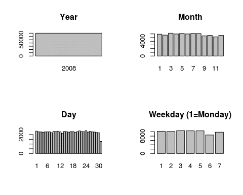
Since we subsetted the data beforehand, it makes sense that all our flights are from 2008. We also see no big changes between the months. There is a slight drop after August, but the remaining changes can be explained by the number of days in a month.
The day of the month shows no influence on the amount of flights, as expected. The fact that the 31st has around half the flights of all other days is also obvious.
When plotting flights per weekday, however, we see that Saturday is the most quiet day of the week, with Sunday being the second most relaxed day. Between the remaining weekdays, there is little variation.
Departure Time
hist(flights$CRSDepTime)
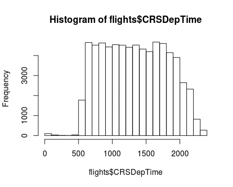
A histogram of the departure time shows that the number of flights is relatively constant from 6am to around 8pm and dropping off heavily before and after that.
Arrival and departure delay
par(mfrow=c(1,3))
hist(flights$DepDelay)
hist(flights$ArrDelay)
plot(flights$DepDelay, flights$ArrDelay)
abline(0,1)
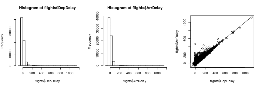
Both arrival and departure delay show a very asymmetric, right-skewed distribution. We should keep this in mind and think about a logarithmic transformation or some other method of acknowledging this fact later.
The structure of the third plot of departure vs. arrival delay suggests that flights that start with a delay usually don’t compensate that delay during the flight. The arrival delay is almost always at least as large as the departure delay.
To get a first overview for our question of how the departure time influences the average delay, we can also plot the departure time against the arrival delay:
plot(flights$CRSDepTime, flights$ArrDelay)
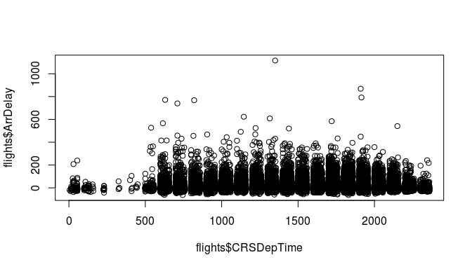
Aha! Something looks weird here. There seem to be periods of times with no flights at all. To see what is going on here, look at how the departure time is coded in the data:
head(flights$CRSDepTime)

## [1] 1625 1230 1355 1455 1350 1930
A departure of 2:55pm is written as an integer 1455. This explains why the values from 1460 to 1499 are impossible. In the feature engineering step, we will have to recode this variable in a meaningful way to be able to model it correctly.
Distance and AirTime
plot(flights$Distance, flights$AirTime)
flights[ which(flights$AirTime>700) , ]

##       Year Month DayofMonth DayOfWeek DepTime CRSDepTime ArrTime CRSArrTime UniqueCarrier FlightNum TailNum
## 15470 2008     3          6         4     906        905    2103       1315            HA         7  N585HA
##       ActualElapsedTime CRSElapsedTime AirTime ArrDelay DepDelay Origin Dest Distance TaxiIn TaxiOut Cancelled
## 15470               837            370     823      468        1    LAS  HNL     2762      5       9         0
##       CancellationCode Diverted CarrierDelay WeatherDelay NASDelay SecurityDelay LateAircraftDelay
## 15470                         0          468            0        0             0                 0
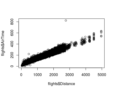
Plotting the distance against the time needed, we see a linear relationship as expected, with one large outlier. This one point denotes a flight of 2762 miles and an air time of 823 minutes, suggesting an average speed of 201mph. I doubt planes can fly at this speed, so we should maybe remove this observation.
flights <- flights[ -which(flights$AirTime>700) , ]
Feature Engineering
Feature engineering describes the manipulation of your data set to create variables that a learning algorithm can work with. Often, this consists of transforming a variable (through e.g. a logarithm), or extracting specific information from a variable (e.g. the year from a date string), or converting something like the ZIP code to a
For our data, we have the following tasks:
- Convert the weekday into a factor variable so it doesn’t get interpreted linearly.
- Create a log-transformed version of the arrival and departure delay.
- Transform the departure time so that it can be used in a model.
- Create the average speed from the distance and air time variables.
Weekday
Converting the weekday into a factor is important because otherwise, it would be interpreted as a metric variable, which would result in a linear effect. We want the weekdays to be categories, however, and so we create a factor with nice labels:
flights$weekday <- factor(flights$DayOfWeek, labels=c("Mon","Tue","Wed","Thu","Fri","Sat","Sun"))log-transform delay times
summary(flights$ArrDelay)

##     Min.  1st Qu.   Median     Mean  3rd Qu.     Max.     NA's
##  -63.000  -10.000   -2.000    8.097   12.000 1116.000     1660

summary(flights$DepDelay)

##     Min.  1st Qu.   Median     Mean  3rd Qu.     Max.     NA's
##  -51.000   -4.000   -1.000    9.968    8.000 1134.000     1469
When looking at the delays, we note that there are a lot of negative values in the data. These denote flights that left or arrived earlier than scheduled. To allow a log-transformation, we set all negative values to zero, which we interpret as “on time”:
flights$ArrDelay <- pmax(0, flights$ArrDelay)
flights$DepDelay <- pmax(0, flights$DepDelay)
Now, since there are zeros in these variables, we create the variables log(1+ArrDelay) and log(1+DepDelay):
flights$logArrDelay <- log(1 + flights$ArrDelay)
flights$logDepDelay <- log(1 + flights$DepDelay)
Transform the departure time
The departure time is coded in the format hhmm, which is not helpful for modelling, since we need equal distances between equal durations of time. This way, the distance between 10:10pm and 10:20pm would be 10, but the distance between 10:50pm and 11:00pm, the same 10 minutes, would be 50.
For the departure time, we therefore need to convert the time format. We will use a decimal format, so that 11:00am becomes 11, 11:15am becomes 11.25, and 11:45 becomes 11.75.
The mathematical rule to transform the “old” time in hhmm-format into a decimal format is:
\(\Large T^{*}= \left \lfloor \frac{T}{100} \right \rfloor + (T\ mod\ 100) / 60\)Here, the first part of the sum generates the hours, and the second part takes the remainder when dividing by 100 (i.e., the last two digits), and divides them by 60 to transform the minutes into a fraction of one hour.
Let’s implement that in R:
flights$DecimalDepTime <- floor(flights$CRSDepTime / 100) + (flights$CRSDepTime %% 100)/60

head(flights$CRSDepTime)

## [1] 1625 1230 1355 1455 1350 1930

head(flights$DecimalDepTime)

## [1] 16.41667 12.50000 13.91667 14.91667 13.83333 19.50000
Of course, you should always verify that your code did what you intended by checking the results.
Create average speed
The average flight speed is not available in the data – we have to compute it from the distance and the air time:
flights$speed <- flights$Distance / (flights$AirTime/60)
boxplot(flights$speed)
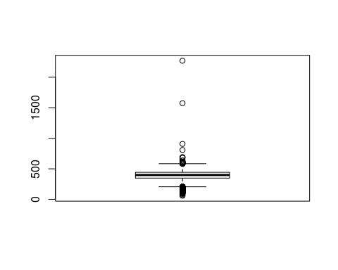
We have a few outliers with very high, implausible average speeds. Domain knowledge or a quick Google search can tell us that speeds of more than 800mph are not maintainable with current passenger planes. Thus, we will remove these flights from the data:
too_fast_index <- which(flights$speed > 800)
flights <- flights[-too_fast_index, ]
Choosing an appropriate Method
For building an actual model with your data, you have the choice between two worlds, statistical modelling and machine learning.
Broadly speaking, statistical models focus more on quantifying and interpreting the relationships between input variables and the outcome. This is the case in situations such as clinical studies, where the main goal is to describe the effect of a new medication.
Machine learning methods on the other hand focus on achieving a high accuracy in prediction, sometimes sacrificing interpretability. This results in what is called “black box” algorithms, which are good at predicting the outcome, but it’s hard to see how a model computes a prediction for the outcome. A classic example for a question where machine learning is the appropriate answer is the product recommendation algorithm on online shopping websites.
For our questions, we are interested in the effects of certain input variables (speed and time of day / week). Thus we will make use of statistical models, namely a linear model and a generalized additive model.
Do planes with a delayed departure fly with a faster average speed to make up for the delay?
To answer our first question, we first plot the variables of interest to get a first impression of the relationship. Since these plots will likely make it to the final report or at least a presentation to your supervisors, it now makes sense to spend a little time on generating a pretty image. We will use the ggplot2 package to do this:
ggplot(flights, aes(x=DepDelay, y=speed)) + geom_point() + geom_smooth(method="lm") +
labs(x="Delay (minutes) at departure", y="Avg. speed (mph)", title="Average speed vs. delay at departure")
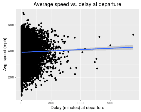
It seems like there is a slight increase in average speed for planes that leave with a larger delay. Let’s fit a linear model to quantify the effect:
mod <- lm(speed ~ DepDelay, data=flights) summary(mod) ## ## Call: ## lm(formula = speed ~ DepDelay, data = flights) ## ## Residuals: ## Min 1Q Median 3Q Max ## -332.15 -43.94 7.07 50.63 300.64 ## ## Coefficients: ## Estimate Std. Error t value Pr(>|t|)
## (Intercept) 3.910e+02  3.054e-01 1280.205  < 2e-16 ***
## DepDelay    3.416e-02  8.499e-03    4.019 5.85e-05 ***
## ---
## Signif. codes:  0 '***' 0.001 '**' 0.01 '*' 0.05 '.' 0.1 ' ' 1
##
## Residual standard error: 74.96 on 68392 degrees of freedom
##   (1660 observations deleted due to missingness)
## Multiple R-squared:  0.0002361,  Adjusted R-squared:  0.0002215
## F-statistic: 16.15 on 1 and 68392 DF,  p-value: 5.852e-05
There is a highly significant effect of 0.034 for the departure delay. This represents the increase in average speed for each minute of delay. So, a plane with 60 minutes of delay will fly 2.04mph faster on average.
Even though the effect is highly significant with a p value of less than 0.0001, its actual effect is negligibly small.
How does the delay of arriving flights vary during the day? Are planes more delayed on weekends?
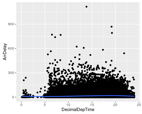
For the second question of interest, we need a slightly more sophisticated model. Since we want to know the effect of the time of day on the arrival delay, we cannot assume a linear effect of the time on the delay. Let’s plot the data:
ggplot(flights, aes(x=DecimalDepTime, y=ArrDelay)) +
geom_point() + geom_smooth()
ggplot(flights, aes(x=DecimalDepTime, y=logArrDelay)) +
geom_point(alpha=0.1) + geom_smooth()
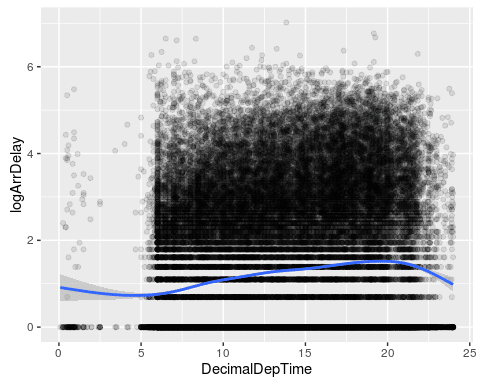
We plot both the actual delay and our transformed log-delay variable. The smoothing line of the second plot gives a better image of the shape of the delay. It seems that delays are highest at around 8pm, and lowest at 5am. This emphasizes the fact that a linear model would not be appropriate here.
We fit a generalized additive model, a GAM, to this data. Since the response variable is right skewed, a Gamma distribution seems appropriate for the model family. To be able to use it, we have to transform the delay into a strictly positive variable, so we compute the maximum of 1 and the arrival delay for each observation first.
flights$posArrDelay <- pmax(flights$ArrDelay, 1)

mod2 <- gam(posArrDelay ~ s(DecimalDepTime), data=flights, family=Gamma(link="log"))
plot(mod2)
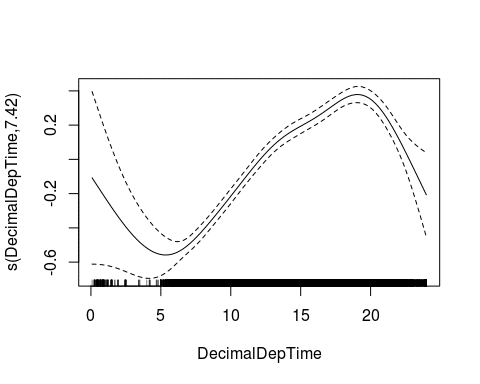
We again see the trend of lower delays in the morning before 6am, and high delays around 8pm. To differentiate between weekdays, we now include this variable in the model:
mod3 <- gam(posArrDelay ~ s(DecimalDepTime) + weekday, data=flights, family=Gamma(link="log"))
With this model, we can create an artificial data frame x_new, which we use to plot one prediction line per weekday:
weekdays <- c("Mon","Tue","Wed","Thu","Fri","Sat","Sun")
x_new <- expand.grid(DecimalDepTime=seq(0,24,by=0.1),
                      weekday=weekdays)

x_new$yhat <- predict(mod3, newdata=x_new, type="response")

Mon <- x_new[x_new$weekday=="Mon",]
plot(Mon$DecimalDepTime, Mon$yhat, type="l", lwd=2, ylim=c(8, 25),
     xlab="Scheduled departure time", ylab="Delay at arrival")
for(d in 2:7){
    dd <- weekdays[d]
    thisday <- x_new[x_new$weekday==dd,]
    lines(thisday$DecimalDepTime, thisday$yhat, type="l", col=d, lwd=2)
}
legend("topleft", lty=1, col=1:7, legend=weekdays, lwd=2)
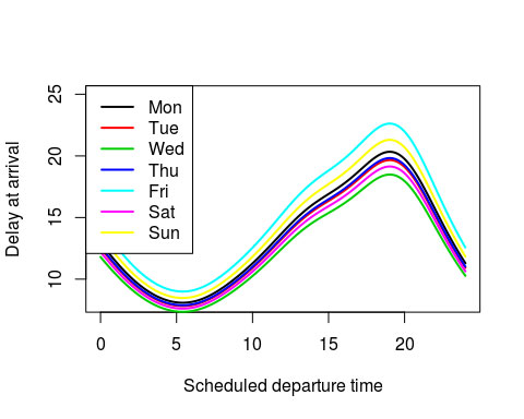
We now see several things:
- The nonlinear trend over the day is the same shape on every day of the week
- Fridays are the worst days to fly by far, with Sunday being a close second. Expected delays are around 20 minutes during rush-hour (8pm)
- Wednesdays and Saturdays are the quietest days
- If you can manage it, fly on a Wednesday morning to minimize expected delays.
Closing remarks
As noted in the beginning of this post, this analysis is only one of many questions that can be tackled with this enormous data set. Feel free to browse the data expo website and especially the “Posters & results” section for many other interesting analyses.