
If you were to look at old company reports from the 1970s, you would find the same standard graphical techniques everyone is familiar with today: pie and bar charts, boxplots, scatter plots and time lines. However, these graphs will be somewhat different from what we are used to nowadays: They are drawn in ink on paper, by hand! This is really what these graphs were intended for: they are easy to draw by hand. Today, nobody is drawing graphs by hand anymore. With R and ggplot we have powerful graphical engines at our disposal, and the majority of graphs are displayed on a screen. The nature of our data has changed a lot: modern data sets tend to have many more data points, and more dimensions. This begs the question: Are the standard graphical techniques outdated, and what are the alternatives?
If you want assistance for professional looking visualizations or data analysis, our experts at Novustat are at your disposal! Contact us for free initial consultation and proposal!
Standard graphs have one major advantage going for them: People are used to these graphs and understand them intuitively. In proposing alternatives, we will focus only on techniques that have something in common with “the old ways”, and should therefore allow for an easy transition and intuituive understanding.
To showcase the graphical techniques we’ll be using a data set on house sales in Grinnell, Iowa from the Stat2Data-package.
rm(list=ls())
 #install.packages("tidyverse")
 #install.packages("Stat2Data")
 library(tidyverse)
 library("Stat2Data")
 data("GrinnellHouses")
Mosaic plots for categorical variables in ggplot
If you have just one categorical variable, bar charts are usually fine (pie charts are not ideal, because the human brain is actually pretty bad at correctly interpreting angles). With two categorical variables, however, you usually want to show how many data points are in each combination of categories, and if there is a pattern in the combinations.
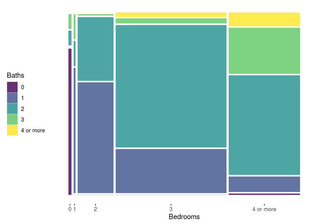
The mosaic plot is a nice alternative to boring frequency tables. The mosaic plot is not native to ggplot2 – we will be using the extension package ggmosaic to display the distribution of the number of Baths and Bedrooms in the Grinnell houses. But first, we do some data wrangling to cut these variables down to a usefull number of categories.
# preparing the data - making broader categories
GrinnellHouses <- GrinnellHouses %>% mutate_at(
.vars = c("Bedrooms", "Baths"),
.funs = function(x) factor(ifelse(x<4, round(x), 4), levels = c(0:4), labels = c(0:3, "4 or more"), ordered = T)
)
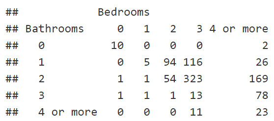
table(Bathrooms=GrinnellHouses$Baths, Bedrooms=GrinnellHouses$Bedrooms, exclude = NULL)
#install.packages("ggmosaic")
library("ggmosaic")

plot_mosaic <- ggplot(GrinnellHouses) +
  geom_mosaic(aes(x = product(Baths, Bedrooms), fill = Baths))

# making the plot nice: dropping the y-axis and background
plot_mosaic_nice <- theme(
  axis.text.y = element_blank(),
  axis.ticks.y = element_blank(),
  axis.title.y = element_blank(),
  panel.background = element_blank(),
  panel.border = element_blank(),
  panel.grid.major = element_blank(),
  panel.grid.minor = element_blank(),
  plot.background = element_blank(),
  legend.position = "left"
  )

plot_mosaic + plot_mosaic_nice
Why mosaic plots work
A mosaic plot can be understood intuitively: the entire rectangle represents 100% of the observations. The area of each mosaic piece shows the proportion of observations in that category combination. The rest basically works like a stacked bar chart, which should be familiar to the average reader.
More dimensions for the mosaic plot
There are options in the ggmosaic package to condition on other variables, but the cleanest way is probably to use facets. Here we further split the data according to the house age – into old pre-WW2 houses and post-WW2 houses.
GrinnellHouses  <- GrinnellHouses %>% mutate(old=factor(YearBuilt<=1945,
                                                        levels = c(TRUE, FALSE),
                                                        labels = c("pre WW2", "post WW2"))
                                             )

plot_mosaic_old <- ggplot(GrinnellHouses) +
   facet_grid(".~old") +
  geom_mosaic(aes(x = product(Bedrooms), fill = Baths)) +
  xlab("Number of Bedrooms")
plot_mosaic_old + plot_mosaic_nice
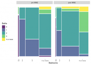
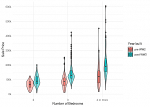
Looking at the color coding, we can easily see that the number of bathrooms has increased in post-WW2 houses. By looking at the width of the vertical bars, one can eyeball that 3 bedroom-houses became more common, and 4 bedrooms less common.
We gladly advise you on how to visualize your data optimally. We are your partner when it comes to target-oriented, meaningful data visualizations. Contact us and arrange a free initial consultation.
Violin plots for numerical variables by categories
Here you usually want to show the distribution of the numerical variable. The boxplot deliberately chooses to display only specific features (median, Q1, Q3) of the distribution. This is great – however there might be important features of the data that will not come to light in the boxplot. So why not combine the boxplot with a violin plot through ggplot?
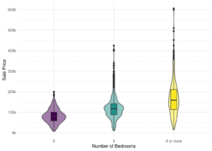
The violin plot is native to ggplot2, just use geom_violin(). We’ll take a look at the price for which the house was sold, conditioning on the number of bedrooms.
ggplot(GrinnellHouses[GrinnellHouses$Bedrooms>1,], aes(y=SalePrice, x=Bedrooms, fill=Bedrooms)) +
  geom_violin(width=.4, alpha=.5) +
  geom_boxplot(width=.1, cex=.5) +
  scale_y_continuous("Sale Price", breaks = seq(0, 600000, by = 100000), labels = str_c(seq(0, 600, by = 100), "k")) +
  xlab("Number of Bedrooms") +
  theme_minimal() + theme(legend.position = "none")
Why the violin plot works
This plot is basically a combination of two familiar graphs, the box and the density plot. The density function of the distribution is however drawn vertically, and mirrored. So the width of the viola shows how many data points are in a given range of values.
More dimensions for the violin plot
By specifying the fill argument and playing around with the position_dodge()-value, we can display separate violas for old and newer houses.
ggplot(GrinnellHouses[GrinnellHouses$Bedrooms>1,], aes(y=SalePrice, x=Bedrooms, fill=old)) +
  geom_violin(width=.4, alpha=.5) +
  geom_boxplot(width=.1, cex=.5, position=position_dodge(.4)) +
  scale_y_continuous("Sale Price", breaks = seq(0, 600000, by = 100000), labels = str_c(seq(0, 600, by = 100), "k")) +
  scale_fill_discrete("Year built") +
  xlab("Number of Bedrooms") +
  theme_minimal()
Ggplot Heatmap for the relationship between numerical variables
Scatter plots are great – but if you have a large data set, they can get messy as there might be simply too many points to see what is going on. A two-dimensional density plots aka heatmap is probably the best solution to communicate where most of the data lies and if there is an association between the variables.
ggplot(GrinnellHouses[GrinnellHouses$SquareFeet<3000,], aes(y=SalePrice, x=SquareFeet)) +
  geom_point(cex=1) +
  stat_density_2d(aes(fill = ..level..), geom = "polygon", colour="white") +
  scale_y_continuous("Sale Price", breaks = seq(0, 600000, by = 100000), labels = str_c(seq(0, 600, by = 100), "k")) +
  theme(legend.position = "none")
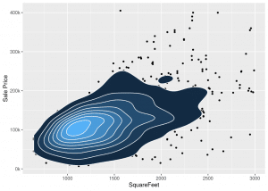
The heatmap can be an alternative to classic scatterplots
Why the Ggplot Heatmap work
The analogy of a topographical map should be intuitive to the average reader. We can see that the most frequent combination of values, e.g. the top of the mountain, is roughly 100k for a house with 1100 SquareFeet. Following the ridge of the mountain, we see that there is a positive association between SquareFeet and SalePrice.
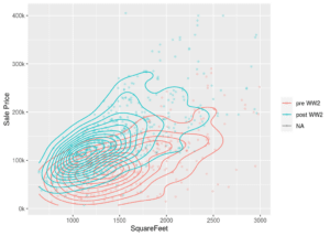
More Dimensions for the Ggplot Heatmap
To bring in the old vs new distinction, we can get rid of the fill argument, and plot the outlines of the 2d-densities on top of each other.
ggplot(GrinnellHouses[GrinnellHouses$SquareFeet<3000,], aes(y=SalePrice, x=SquareFeet, color=old)) +
  geom_point(cex=1, alpha=.2) +
  geom_density_2d() +
  scale_y_continuous("Sale Price", breaks = seq(0, 400000, by = 100000), labels = str_c(seq(0, 400, by = 100), "k")) +
  scale_color_discrete(name = "")
Animate your graphs with ggplot!
Finally, we might take a look at what happened to average house prices during the financial crisis. Instead of plotting a static time line, an animated gif might be more exciting. This is easily done with the gganimate-package, also an extension package to ggplot2.
# calculating the means by year
means <- GrinnellHouses %>% filter(Bedrooms!=0) %>% group_by(YearSold) %>% summarize(meanprice=mean(SalePrice, na.rm=T))

# set up static time line plot
p <- ggplot(means, aes(y=meanprice, x=YearSold)) +
  geom_line() + geom_point() +
  scale_y_continuous("Average Sale Price") +
  scale_x_continuous("Year", breaks = 2005:2015) +
  theme_minimal()

# install.packages("gganimate")
# install.packages("gifski")
# install.packages("transformr")
library("gganimate")
library("gifski") # gif renderer
library("transformr")

# animate static plot
anim <- p + transition_reveal(YearSold) + ease_aes('cubic-in-out') # set reveal dimesion to year
animate(anim, nframes = 100, end_pause = 50, renderer = gifski_renderer("gganim.gif")) # set parameters for gif and render to file
Animated Graphs capture the attention of you audience
Why animated graphs work
We are certainly not suggesting animating all graphs – but in a presentation or on your website, an animated graph will surely grab the attention of your audience!
More dimensions for animated graphs
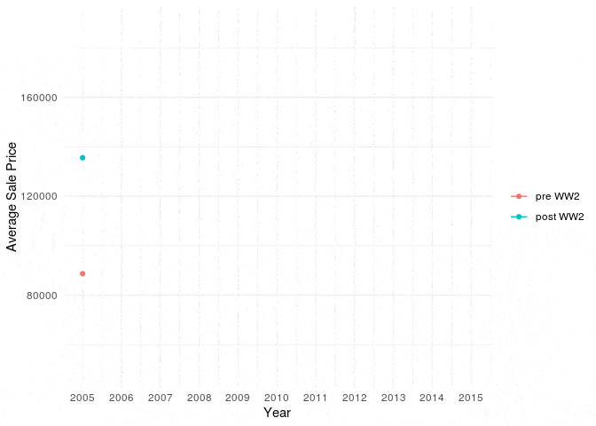
Simply adjust the data grouping when calculating the means, and add a color-argument to the aesthetics. The code for the animation stays the same. Interestingly, the dip in average house prices during the financial crisis wasn’t so bad for older houses!
# set up static time line plot
means <- GrinnellHouses %>% filter(Bedrooms!=0) %>% group_by(YearSold, old) %>% summarize(meanprice=mean(SalePrice, na.rm=T))

p <- ggplot(means, aes(y=meanprice, x=YearSold, color=old)) +
  geom_line() + geom_point() +
  scale_y_continuous("Average Sale Price") +
  scale_x_continuous("Year", breaks = 2005:2015) +
  scale_color_discrete("") +
  theme_minimal()

# animate static plot
anim <- p + transition_reveal(YearSold) + ease_aes('cubic-in-out') # set reveal dimesion to year
animate(anim, nframes = 100, end_pause = 50, renderer = gifski_renderer("gganim.gif")) # set parameters for gif and render to file
Conclusion: Better data visualization with ggplot
The standard graphical techniques that everyone is familiar with such as barcharts, boxplots and scatter plots will remain the workhorse for data visualisation. But sometimes we can do just a little bit better when communicating our data, without requiring a leap of faith from our audience. Using the awesome capabilities of ggplot2, we proposed four alternatives – the mosaic plot, the violin plot, the ggplot heatmap and animations – which just might strike the right balance between innovation and tradition.